Today, a website is one of the most powerful marketing tools for any business. It’s not just a digital storefront but a crucial element of your brand identity and customer engagement strategy. The reality is, people are judging your business by your website. In fact, Stanford University research shows that 75% of users make judgments about a company’s credibility based on its web design. But what makes a business website truly effective? It’s not just about looking good—it’s about creating a user experience that’s seamless, informative, and engaging. Whether you’re launching a new website or looking to enhance an existing one, here are the ten must-have features that every business website should include to stand out in today’s competitive digital landscape.
1. Fast Load Times
In the fast-paced digital world, speed is king. No one likes waiting around, especially online. Studies show that if a website takes more than three seconds to load, over half of the visitors will abandon the page. A slow website not only frustrates users but also hurts your search engine rankings, making it harder for potential customers to find you.
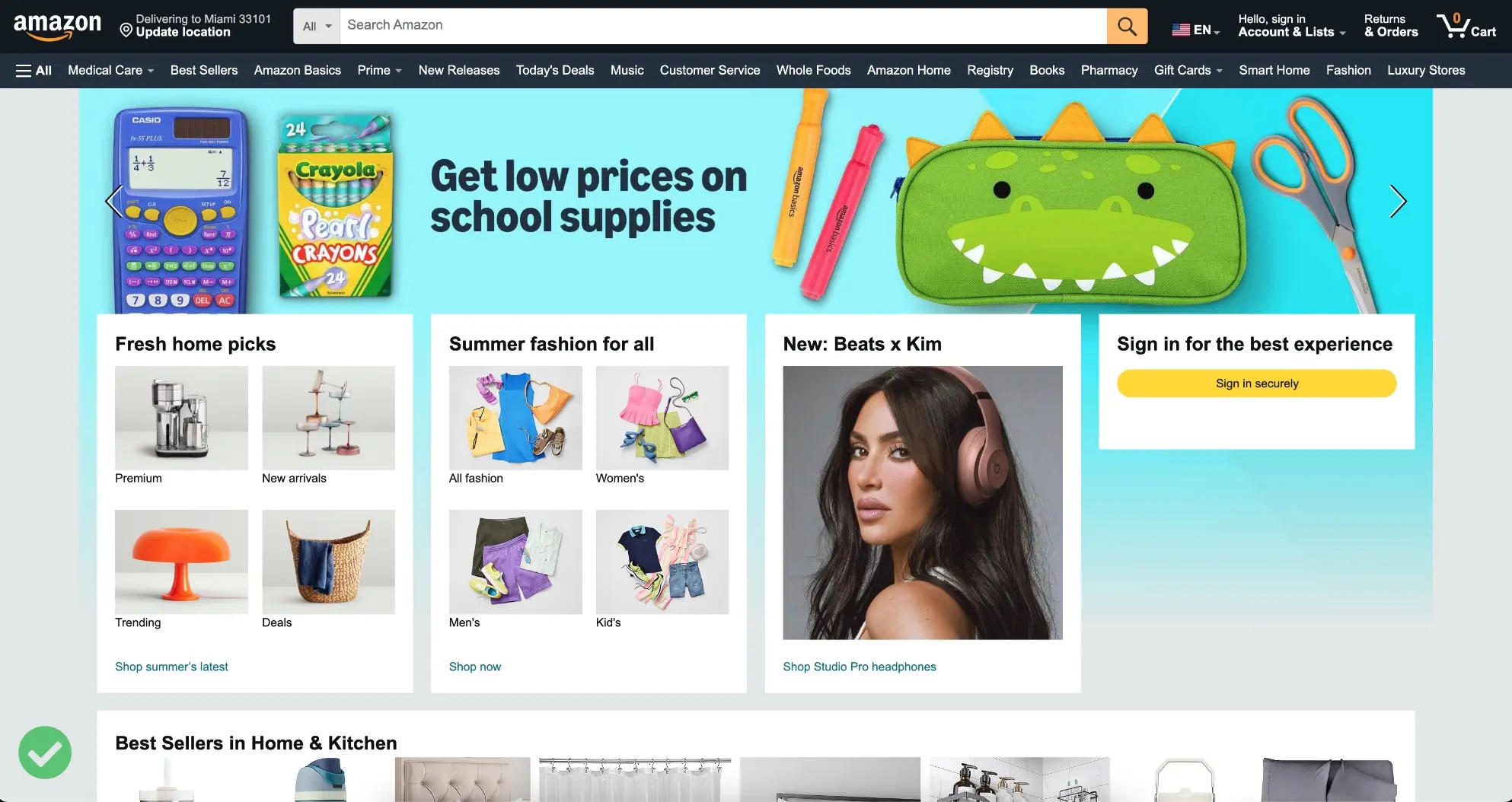
- Good Example: Amazon is renowned for its quick load times. They’ve invested heavily in optimizing their website’s speed because they understand that every millisecond counts. By ensuring their pages load almost instantly, Amazon keeps users engaged and boosts their chances of making a sale.
- Bad Example: Imagine a local bakery's website that takes 8-10 seconds to load each page because it uses unoptimized, high-resolution images and numerous plugins. Frustrated users are likely to leave the site before seeing the menu or placing an order.
- Tip: To ensure your website loads quickly, optimize your images, leverage browser caching, and minimize CSS, JavaScript, and HTML. Regularly monitor your website’s speed using tools like Google PageSpeed Insights to ensure it performs at its best.
2. Mobile Responsiveness
More people are browsing the internet on their smartphones than ever before. In fact, over 54% of global web traffic now comes from mobile devices. If your website isn’t optimized for mobile, you’re potentially losing half of your audience.
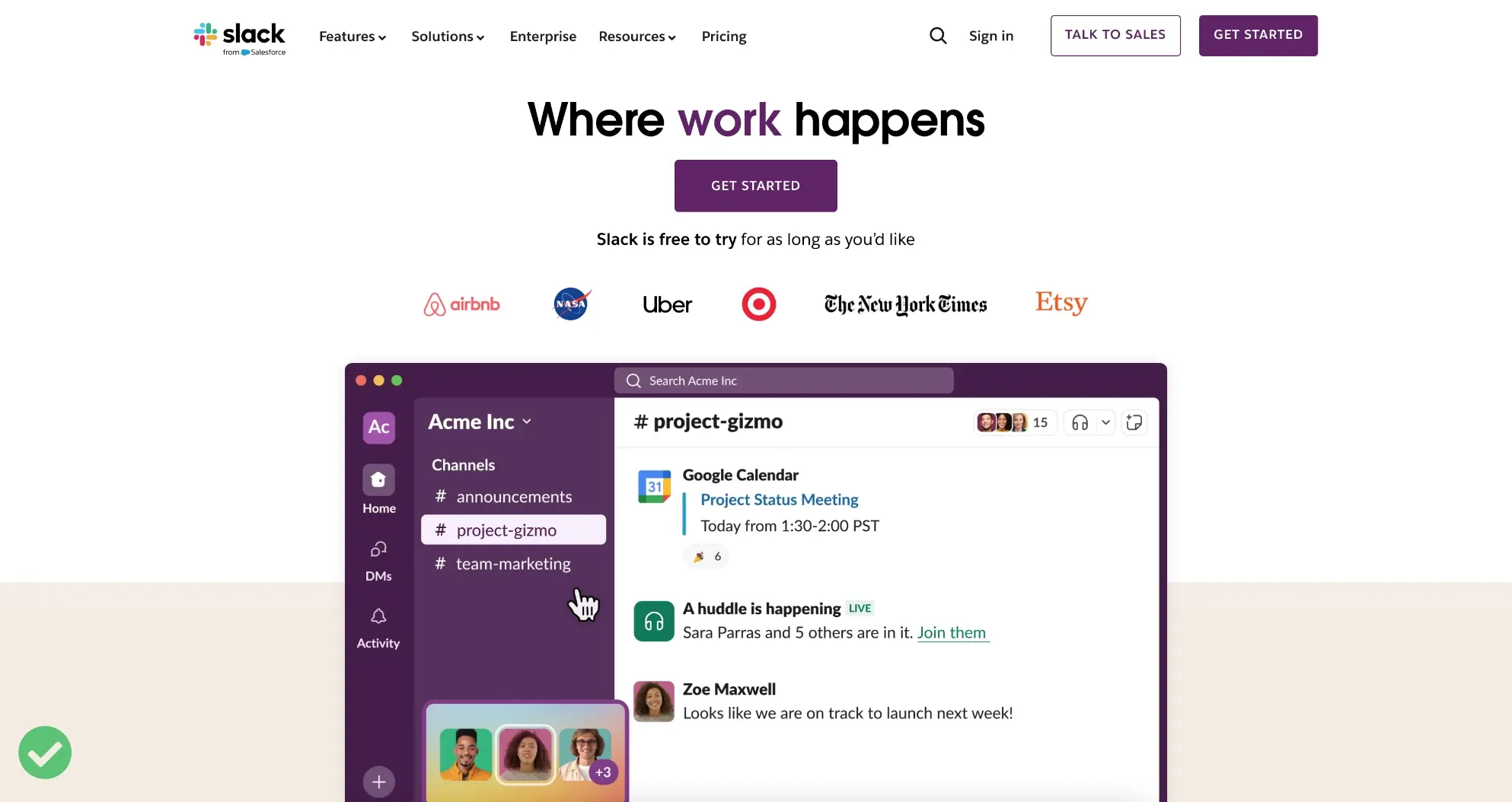
- Good Example: The website for Slack is an excellent example of mobile responsiveness. The design adjusts seamlessly to different screen sizes, ensuring a consistent user experience across all devices. Menus are easy to navigate, text is readable, and the overall design remains intact.
- Bad Example: A small consulting firm’s website that looks great on desktop but is unusable on mobile devices. The text is tiny, images are misaligned, and the navigation menu doesn’t function correctly. As a result, mobile users leave the site immediately.
- Tip: Use responsive web design techniques and test your site on multiple devices to guarantee that all users have a positive experience, no matter how they access your site.
3. Clear and Effective Call to Action (CTA)
Every business website should guide visitors toward taking specific actions, and that’s where a Call to Action (CTA) comes in. Whether you want users to sign up for a newsletter, request a quote, or purchase a product, a clear and compelling CTA is essential.
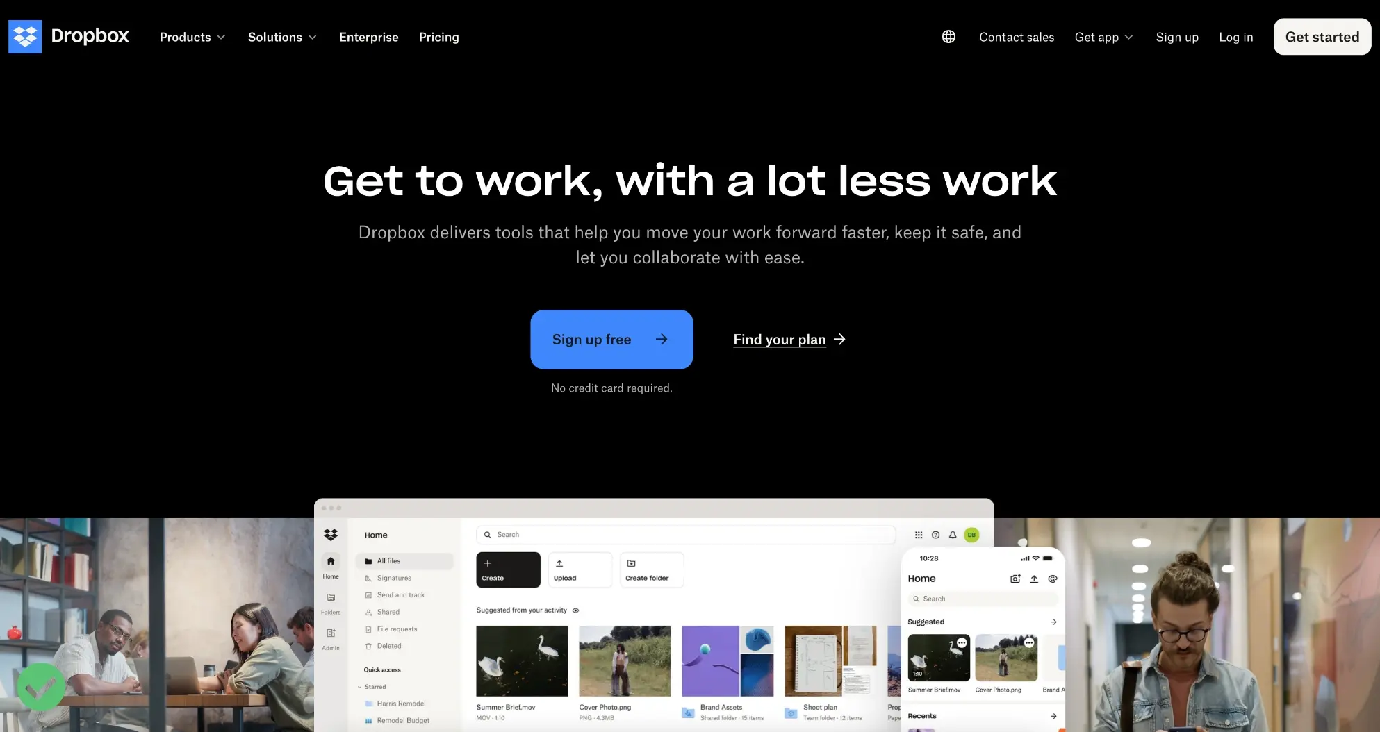
- Good Example: Dropbox uses a simple yet effective CTA: “Sign up free” It’s clear, direct, and offers value, prompting users to take the desired action. The button is strategically placed and stands out due to its contrasting color.
- Bad Example: A real estate website with a CTA that says “Click Here” on a button at the bottom of a long page, with no context provided. The generic text and poor placement fail to guide the user, resulting in low engagement rates.
- Tip: Place CTAs strategically throughout your website, using contrasting colors to make them stand out. The language should be persuasive but straightforward—think “Get Started,” “Contact Us,” or “Download Now.”
4. Professional Design and Branding
Your website is a digital representation of your business, and its design should reflect your brand’s identity and values. Consistent branding across your website helps to establish your brand’s image and builds trust with your audience.
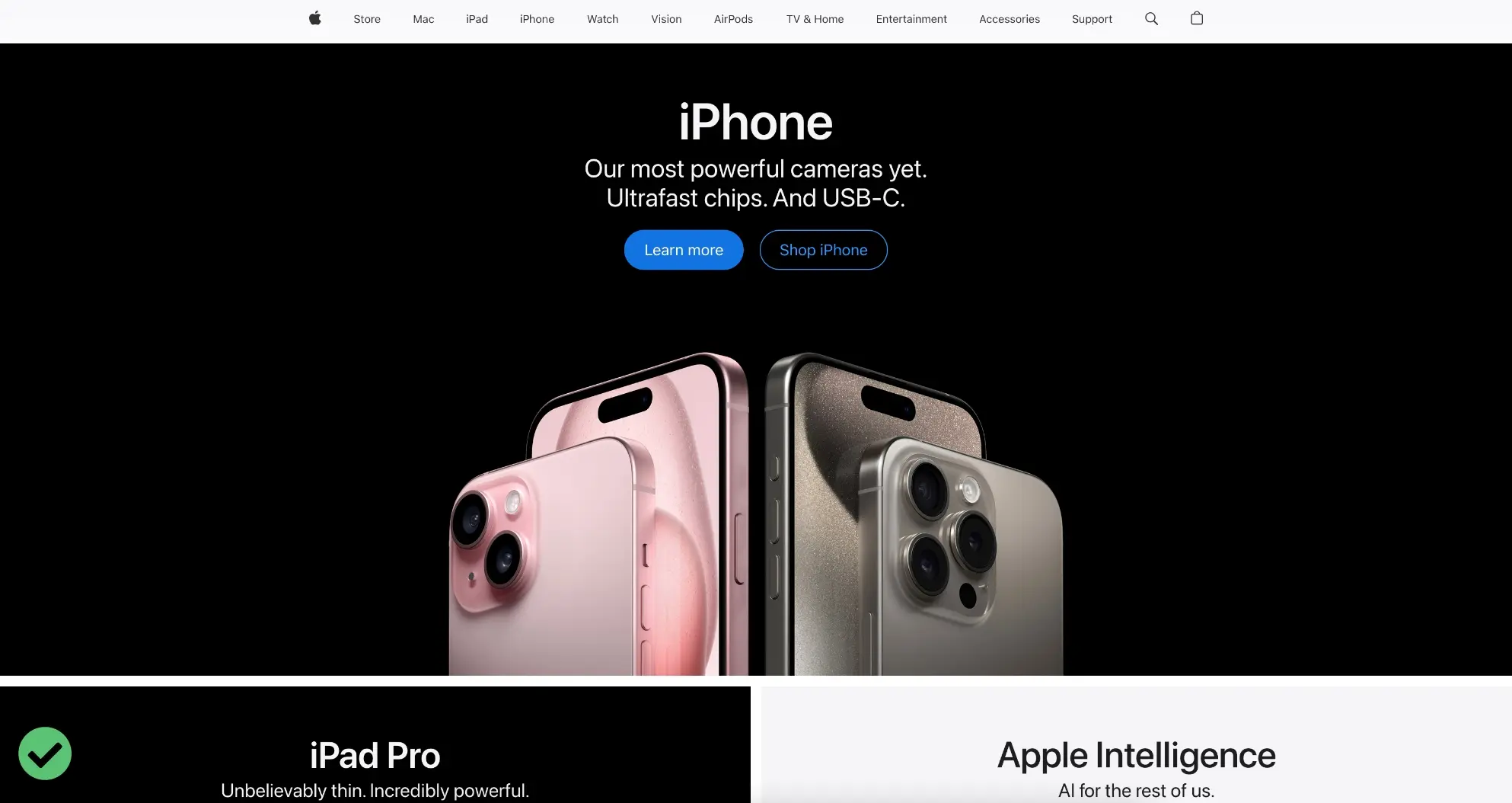
- Good Example: Apple's website is a perfect example of professional design and branding. The minimalist layout, high-quality visuals, and clean typography are instantly recognizable and aligned with Apple’s brand image of innovation and quality.
- Bad Example: A tech startup with a website that uses clashing colors, inconsistent fonts, and low-quality images. The lack of cohesive branding makes the company appear unprofessional and untrustworthy.
- Tip: Invest in professional design that uses your brand's colors, fonts, and imagery consistently throughout the site. A clean, modern design that aligns with your branding can make your business appear more credible and professional.
5. User-Friendly Navigation
Imagine walking into a store where everything is chaotic, and you can’t find what you’re looking for. That’s what it feels like to navigate a poorly structured website. A well-organized navigation menu helps visitors find what they need quickly and easily.

- Good Example: The BBC News website offers a clear, straightforward navigation menu with categories like Home, News, Sport, Innovation, and more. Users can easily find the section they’re interested in, improving the overall experience.
- Bad Example: A local artist's portfolio website with no navigation menu, only endless scrolling. Visitors struggle to find specific pieces or information about the artist, leading to frustration and potentially leaving the site.
- Tip: Keep the most important pages (like About, Services, and Contact) easily accessible. For content-heavy websites, include a search bar to help users find specific information.
6. Contact Information and Forms
One of the primary purposes of a business website is to facilitate communication with potential customers. Make sure your contact information is easy to find. This includes your phone number, email address, and physical address if applicable.
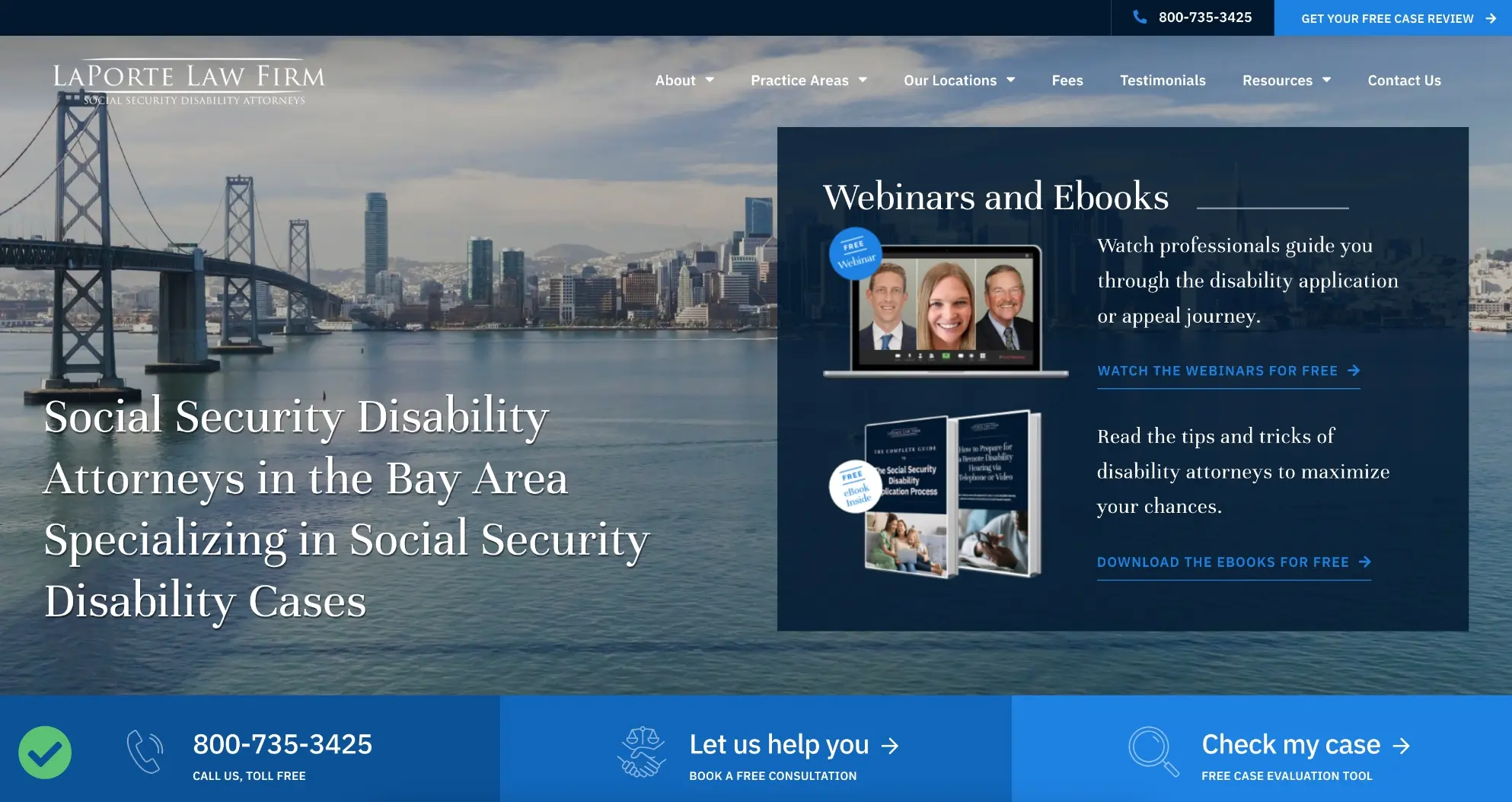
- Good Example: A law firm’s website that displays contact information at the top of every page, along with a dedicated “Contact Us” page featuring a simple form, office locations, and phone numbers. It makes reaching out easy for potential clients.
- Bad Example: An e-commerce store with no visible phone number or email address. The only way to contact customer service is through a hidden link buried in the footer, leading to customer frustration and abandoned purchases.
- Tip: Besides prominently displaying contact information, include a simple, straightforward contact form. Forms should have just a few fields to encourage users to reach out without feeling overwhelmed.
7. Social Proof (Testimonials and Reviews)
Social proof is a powerful psychological phenomenon where people conform to the actions of others, under the assumption that those actions reflect the correct behavior. Including testimonials, reviews, and case studies on your website can significantly boost credibility and influence purchasing decisions.
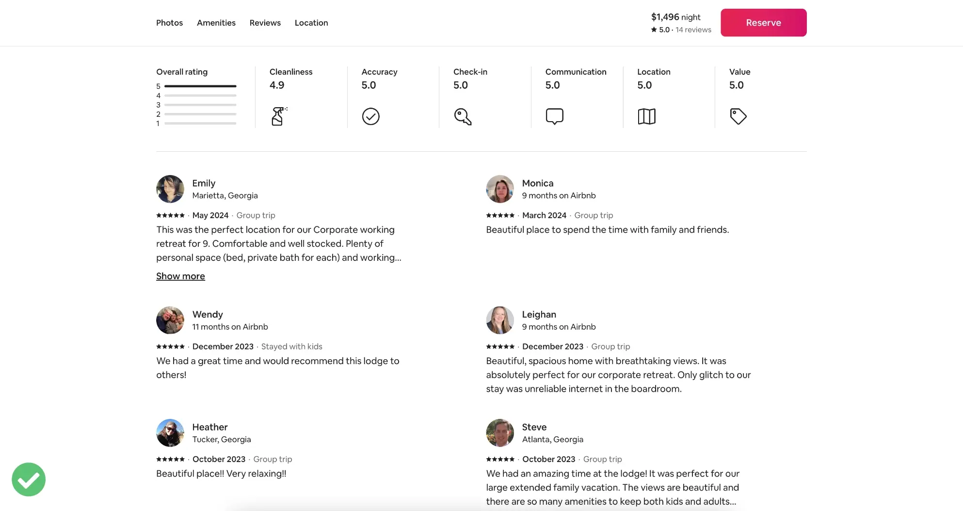
- Good Example: The website for Airbnb showcases user reviews and ratings prominently on each listing. This transparency builds trust and helps new users feel more confident about booking accommodations.
- Bad Example: A local contractor’s website that features only a few vague testimonials with no names or photos. The lack of detailed and verifiable social proof makes the testimonials seem less credible.
- Tip: Include logos of your clients, testimonials, star ratings, and review snippets to enhance your site's credibility. People are more likely to trust and engage with a business that has proven success stories.
8. High-Quality Content
Content is at the heart of any successful website. Not only does it engage your visitors, but it also plays a crucial role in your search engine optimization (SEO) efforts. According to HubSpot, companies that publish blog posts regularly receive 55% more website visitors.
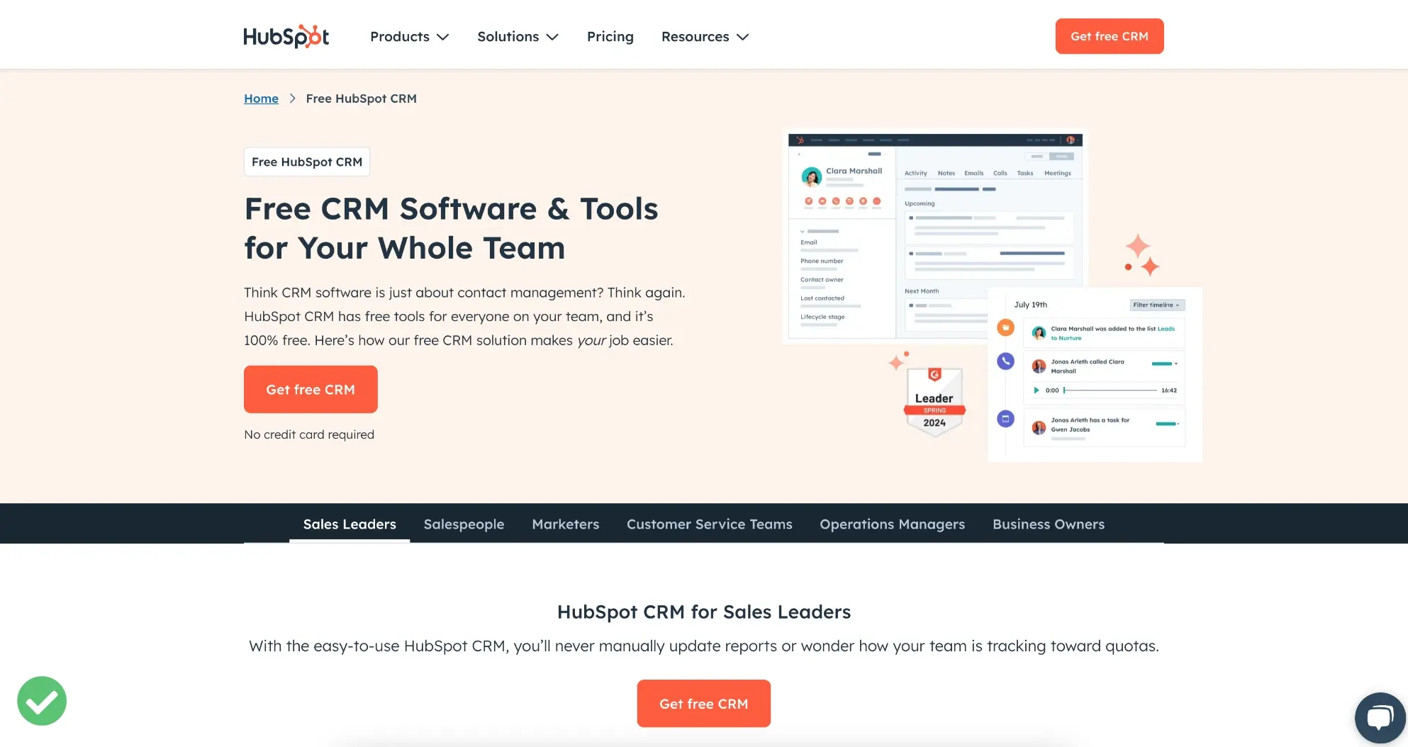
- Good Example: HubSpot is known for its comprehensive and valuable content, including blog posts, e-books, and webinars. Their content not only attracts visitors but also positions them as thought leaders in the industry.
- Bad Example: A financial advisor’s website that hasn’t updated its blog in over a year and only features a few short, generic articles. The lack of fresh, valuable content discourages repeat visits and offers no incentive for users to explore the site further.
- Tip: Regularly updating your site with fresh content, such as blog posts, articles, and guides, not only keeps visitors engaged but also signals to search engines that your site is active and relevant.
9. Security Features
With cyber threats on the rise, website security is a critical concern for both businesses and customers. Implementing robust security measures is essential to protect sensitive data and maintain trust.
- Good Example: An e-commerce site that uses SSL encryption, regularly updates its software, and has visible security badges on its checkout pages. These features reassure customers that their personal information is protected.
- Bad Example: A small business website without SSL certification, displaying a “Not Secure” warning in the browser bar. Visitors are immediately put off, fearing that their data could be compromised.
- Tip: Start by installing an SSL certificate to encrypt data and provide a secure browsing experience. Regularly update your website's software, including themes and plugins, to patch vulnerabilities.
10. Analytics and Tracking Tools
Understanding how visitors interact with your website can provide valuable insights that drive business decisions. Tracking tools help monitor website traffic, user behavior, and conversion rates, enabling data-driven improvements.

- Good Example: A SaaS company that uses Google Analytics and Hotjar to monitor user behavior and gather feedback. These insights help them continuously optimize their website and improve the user experience.
- Bad Example: A local restaurant’s website with no tracking tools in place. The owners have no idea how visitors are finding the site, what pages are most popular, or why users leave the site without making a reservation.
- Tip: Implement tools like Google Analytics, which provide detailed insights into how users interact with your site. Use these insights to make data-driven decisions to enhance user experience and achieve your business goals.
Conclusion
A successful business website is more than just an online presence; it’s a strategic tool that can drive growth and brand recognition. By ensuring your site includes these ten must-have features, you can create a user experience that is not only engaging and informative but also trustworthy and effective. Regularly review and update your website to keep up with changing trends and technologies, ensuring it continues to serve your business objectives and meet your customers’ needs.
Is your business website lacking these essential features?
Let us help you build a high-performing, user-friendly, and secure website that meets your business goals. Our expert team specializes in WordPress website design and development to create a site that not only looks great but also drives results.


