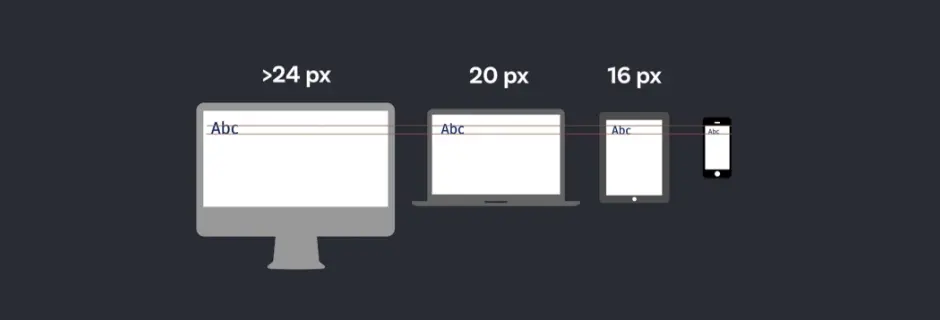
Ensuring that your website looks impeccable across devices of varying sizes is not just a preference; it’s a necessity. One crucial aspect of this adaptability is font size. Enter the world of responsive font sizing—a realm where text adjusts effortlessly to fit any screen.
Traditionally, achieving responsive font sizes involved the cumbersome choreography of @media queries, adjusting font sizes at predefined breakpoints. However, there’s a sleeker, more elegant solution: the CSS snippet that’s becoming ubiquitous across modern websites:
					:root {
  font-size: calc(1rem + 0.25vw);
}
This snippet encapsulates a simple yet powerful concept: the font size is determined by a base size (1rem) plus a fraction (0.25vw) of the viewport width (vw). Let’s unpack this.
-
Rooting in Rem: The
remunit, short for "root em," is relative to the font size of the root element (). By setting the root font size, we establish a consistent baseline for all other font sizes on the page. - Viewport Width (vw): Here's where the magic happens. Instead of fixed breakpoints, we leverage the viewport width—a fluid measure that adjusts with the user's device. The font size scales smoothly, seamlessly adapting to different screen sizes without the need for explicit breakpoints.
This approach offers a cleaner, more mathematically elegant solution compared to traditional breakpoint-based styling. Gone are the days of juggling multiple @media queries; with a single line of code, your font sizes gracefully scale across devices.
But wait, you might wonder, how does this formula compare to the conventional approach?
Consider the typical setup:
					p { font-size: 1.125rem; }
@media (min-width: 740px) {
  p { font-size: 1.25rem; }
}
While effective, it requires manual intervention at specific breakpoints. This piecemeal approach can lead to inconsistencies and added complexity as your design evolves.
In contrast, the responsive font-size formula provides a unified, linear solution that elegantly adapts to any screen size. It’s a testament to the power of CSS in streamlining web development workflows and enhancing user experiences.
Conclusion
Responsive font sizing isn’t just about aesthetics—it’s about accessibility, usability, and staying ahead in the ever-evolving digital landscape. By embracing formulas like calc(1rem + 0.25vw), you empower your website to deliver a consistent, polished experience across devices, ensuring that your content shines, regardless of the screen it’s viewed on.
Ready to elevate your website’s design and development? Our team specializes in website design and development services that marry cutting-edge technology with timeless aesthetics. Contact us today to embark on your digital journey.